2021 required maps that were large, uncluttered, and attractive.
Large—keep the users 6 feet apart.
Uncluttered—how fast can the person reading the map use the map to answer the question they’ve asked of the map. (We are excellent at that.)
Attractive—2021 called us to create maps for presentations, home offices and conference rooms. Our 2021 maps were not only useful, but designed to add an aesthetic to the user’s environment that was unique and appropriate.
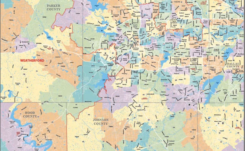
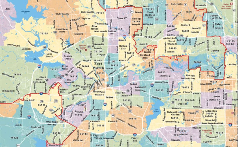
Fort Worth, Texas Map
This client had a need to clearly define the zip code territories. White roads show detail to help identify intersections but did not overpower the map. The customer requested our new Power Pastel Color Scheme.
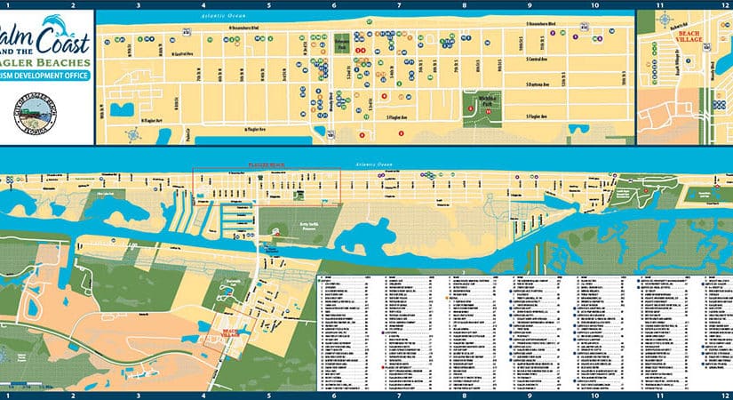
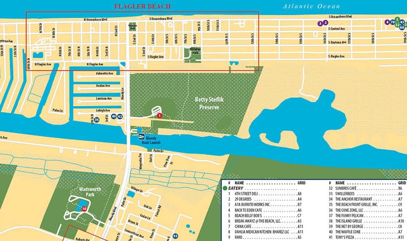
Palm Coast, Florida Map
This tourist map is displayed at a visitor’s center and printed at 8 feet wide by 4 feet tall. Each dot is color-coded for quick reference in the index so that anything can be found in seconds.
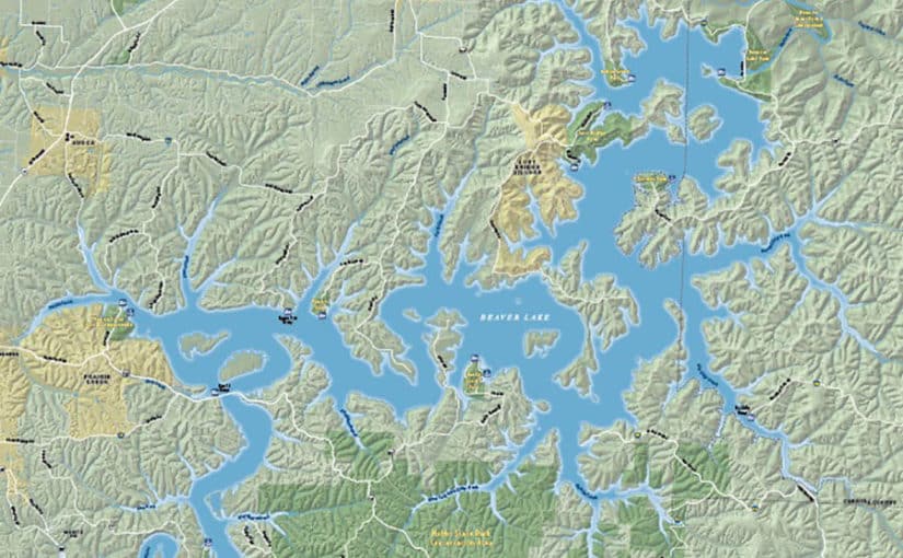
Beaver Lake, Arkansas Map
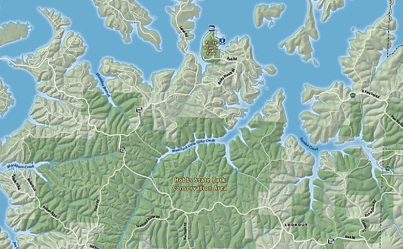
We can now create this level of detail for all of the United States and Canada. The beautifully detailed terrain imagery projects a feel of the land’s surface while showing the roads and points of interest.
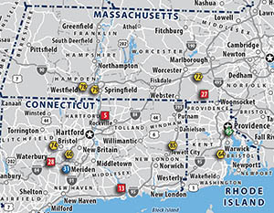
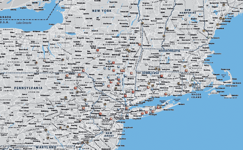
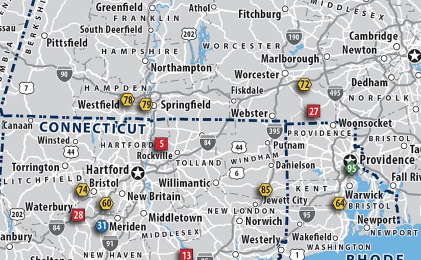
New England Map
We created this map of a customer’s territory identifying the different locations of their plants and supply points. The subtle background helps the important locations pop and eliminates the need for an index.
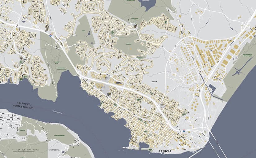
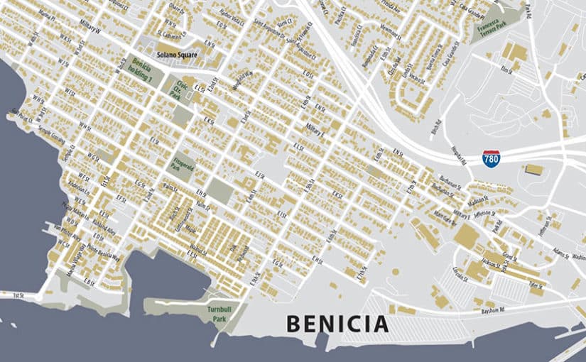
Benica, California Map
When building footprints are important, the map needs to be large and legible. The cool colors is one of our most popular styles for an all-street map. This style is often used by emergency first responders for extremely quick reference.
We hope you enjoyed a look at these maps. With the advancements of cartographic technology over the last several years, making your map clean, useful and attractive doesn’t have to cost more. As ever, we’re the passionate map geeks that make sure you get the Right Map.
